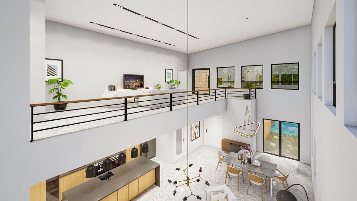
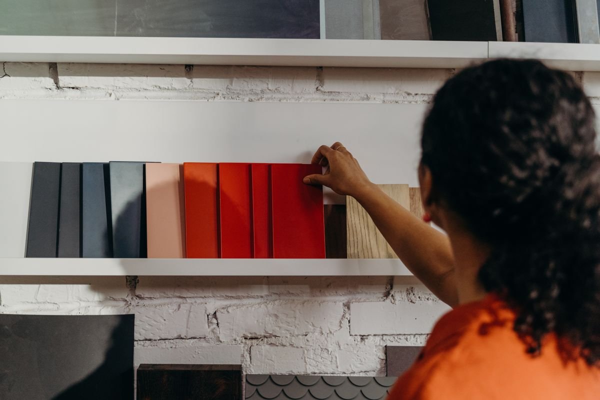
Choosing palettes that evoke warmth, energy, or calm to match your vision, tailored to your space, natural light, and lifestyle.
One bold wall can change the whole room. We pick the right wall, shade and finish so the colour adds depth and personality without overpowering the space.
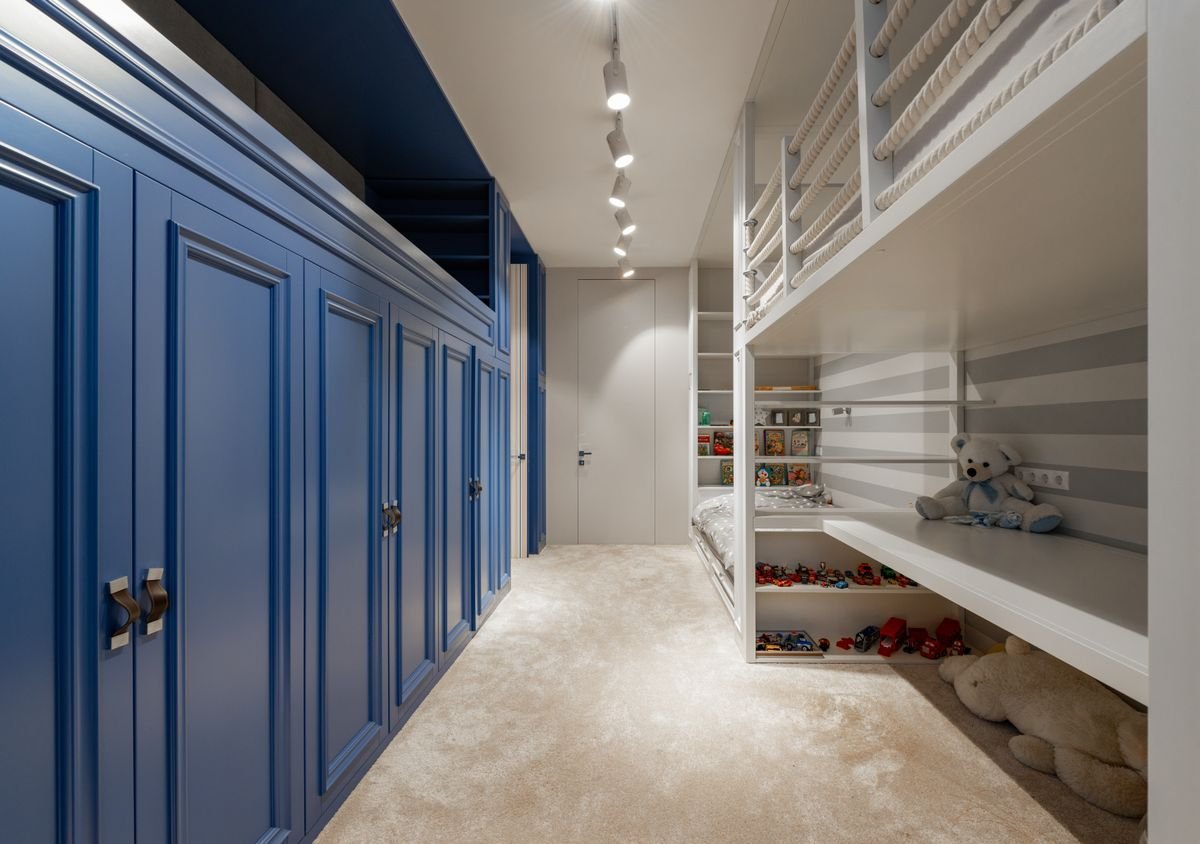
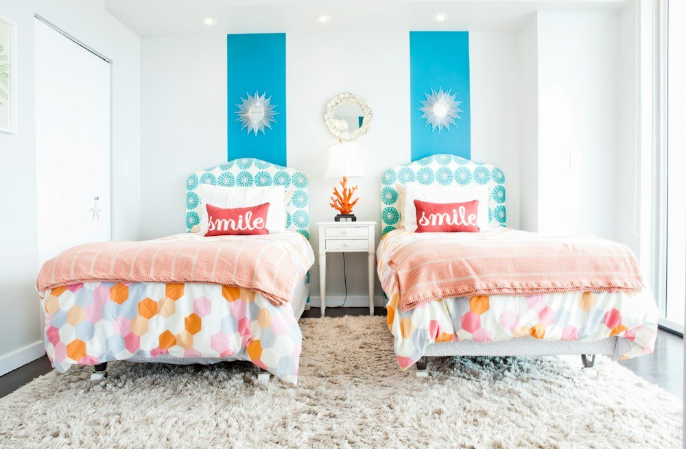
Cheerful yet calming schemes that spark creativity, support good sleep, and are easy to update as your child grows.
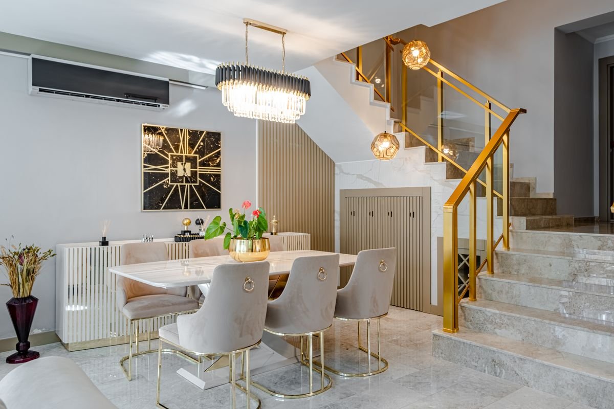
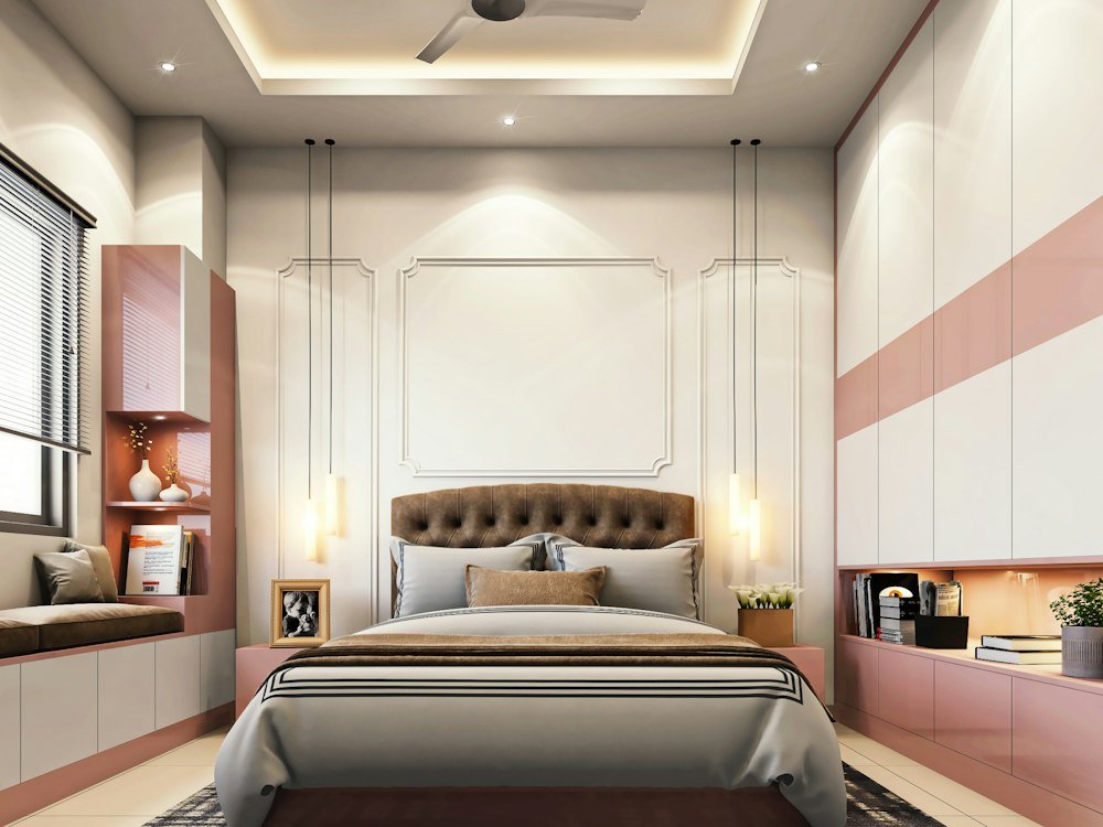
Soft ivory, greige and taupe bases lifted with gold, brass or rose-gold details for an elegant, hotel-style finish.
A starting point for your consultation — we’ll fine-tune any of these, or build one from scratch, around your space and natural light.
Cozy, timeless tones that are easy to live with.
Calm, airy blues and greens inspired by the sea.
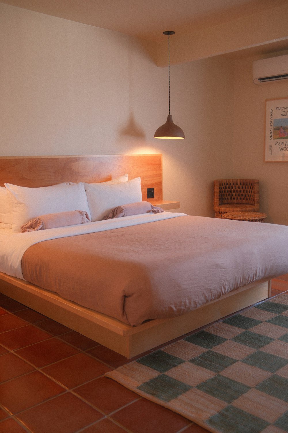
Grounded, sun-baked warmth for an inviting space.
Rich, dramatic hues for a luxurious statement.
Gentle, soothing shades with a playful touch.
Sleek, minimal greys for a confident, clean look.
Fresh, nature-inspired greens that bring calm indoors.
Deep navy paired with gold for a rich, regal feel.
Warm, energising yellows and oranges full of cheer.
Each room has a different job. Here is how we approach colour for each one, with shades that work and ones to avoid.
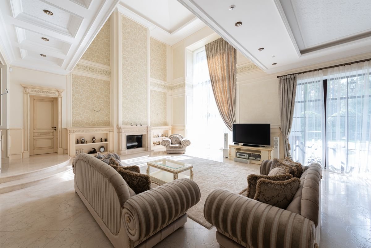
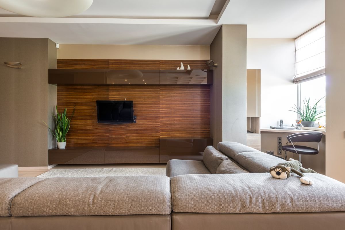
The busiest room needs colours that feel inviting in daylight and cosy at night, and that work with your furniture and art.
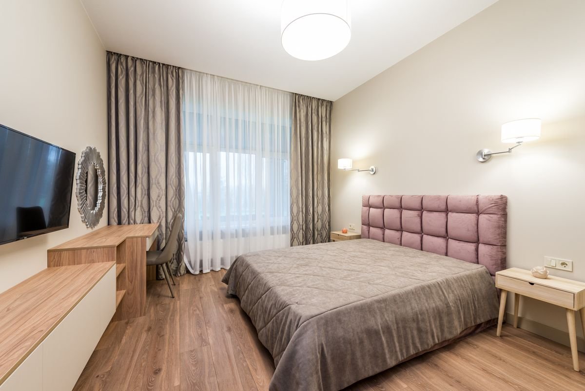
Soft, muted colours help the mind slow down. Deeper shades behind the headboard add a cocooning feel.
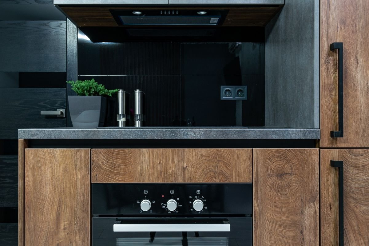
Kitchens handle heat, steam and splashes, so we pair fresh colours with washable finishes and coordinate with cabinet shutters.
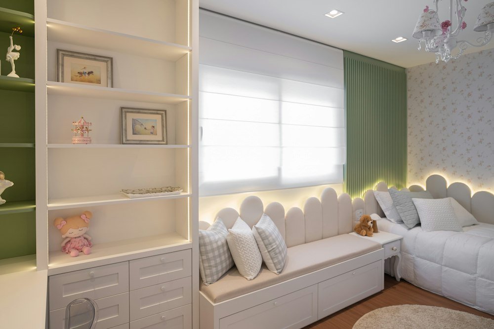
Use cheerful colours in doses, such as a feature wall or stripes, over a calm base, so the room stays restful at bedtime.
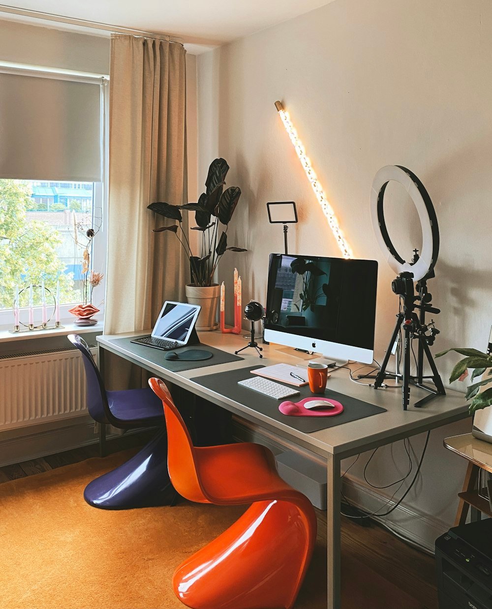
Greens and blues support concentration. A mid-tone behind your desk also looks great on video calls.
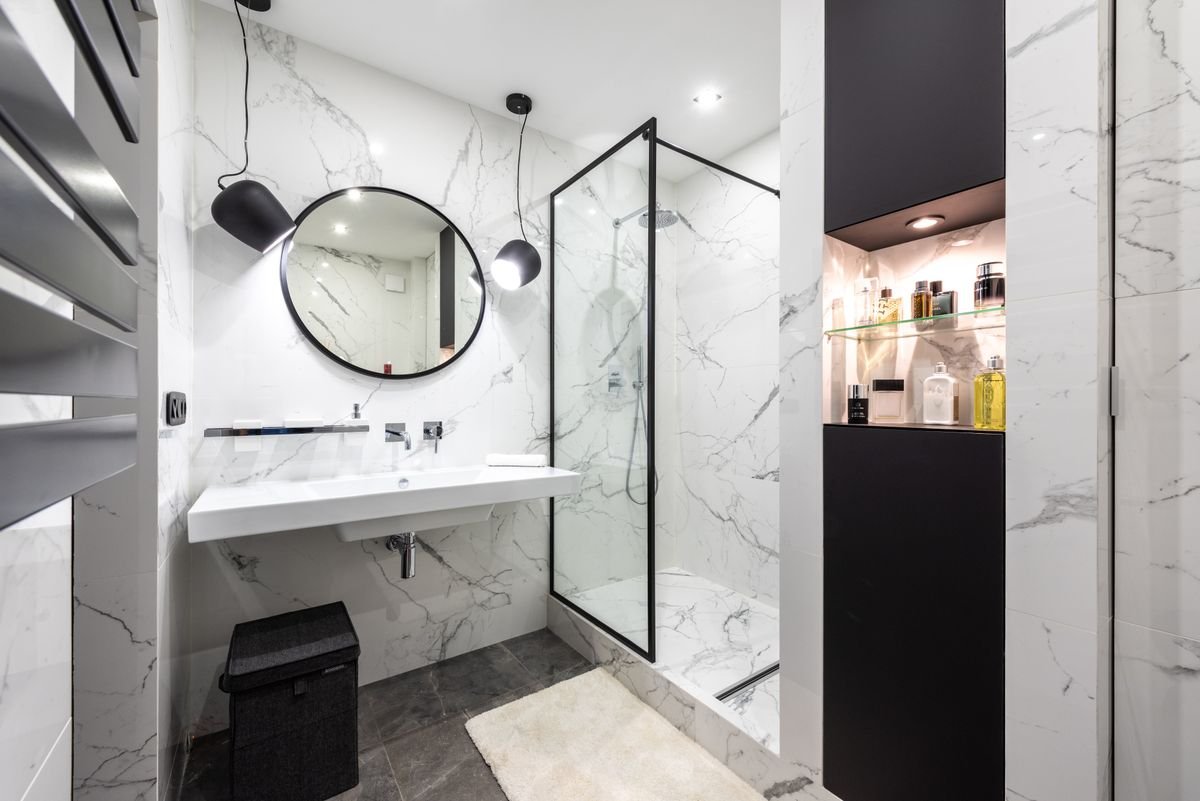
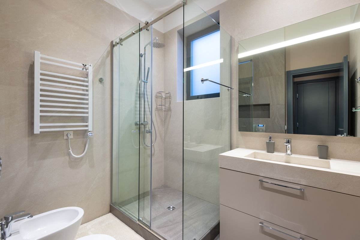
Light, airy colours and moisture-resistant paint keep bathrooms fresh, while tiles bring the pattern.
Colour changes how a room feels, so we choose shades for the mood you want, not just the look.
Calm, trust and focus. Great for bedrooms, bathrooms and studies.
Balance and freshness. Works almost anywhere, especially living rooms.
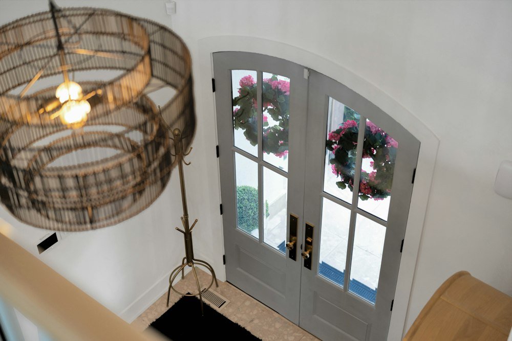
Cheerful and energising. Ideal for kitchens, entrances and kids' rooms.
Warm and sociable, and it stimulates appetite. Use it on dining accent walls.
Timeless and versatile. The perfect base for any style.
Luxury and creativity. Best as an accent in lounges or dressing areas.
Modern and sophisticated. Pair with wood or warm light to avoid coldness.
Soft, nurturing and romantic. Lovely in bedrooms and girls' rooms.
Simple rules our colour consultants follow on every project.
60% main colour (walls), 30% secondary (furniture, curtains) and 10% accent (cushions, art).
North-facing rooms get cooler, softer light, so warm up the shades. South-facing rooms can take cooler tones.
Colours change with light. We paint large sample patches and check them morning, afternoon and night.
A ceiling one or two shades lighter than the walls makes rooms feel taller and brighter.
Choose shades from the same family so the home flows naturally from room to room.
Matte hides flaws, satin is washable, and gloss suits trims and doors.
We look at your rooms, light direction, flooring and furniture.
2–3 curated palettes with a mood for each room.
Test patches painted on your actual walls.
Final shade codes, finishes and wall-by-wall plan for painters.
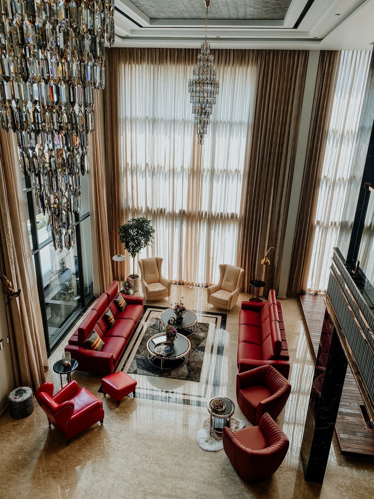
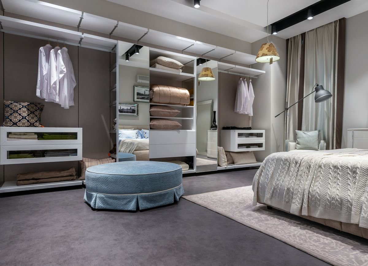
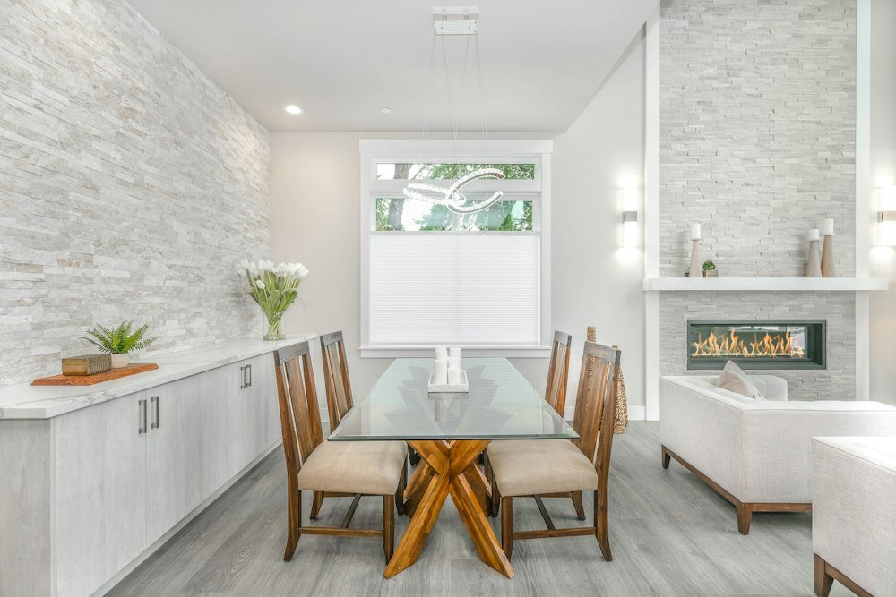
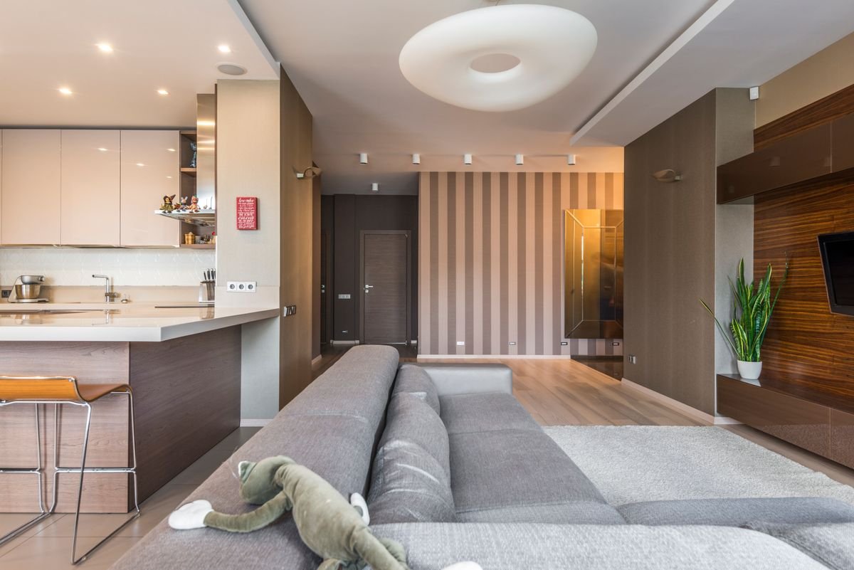

We create personalized living spaces that reflect your style and functional needs.
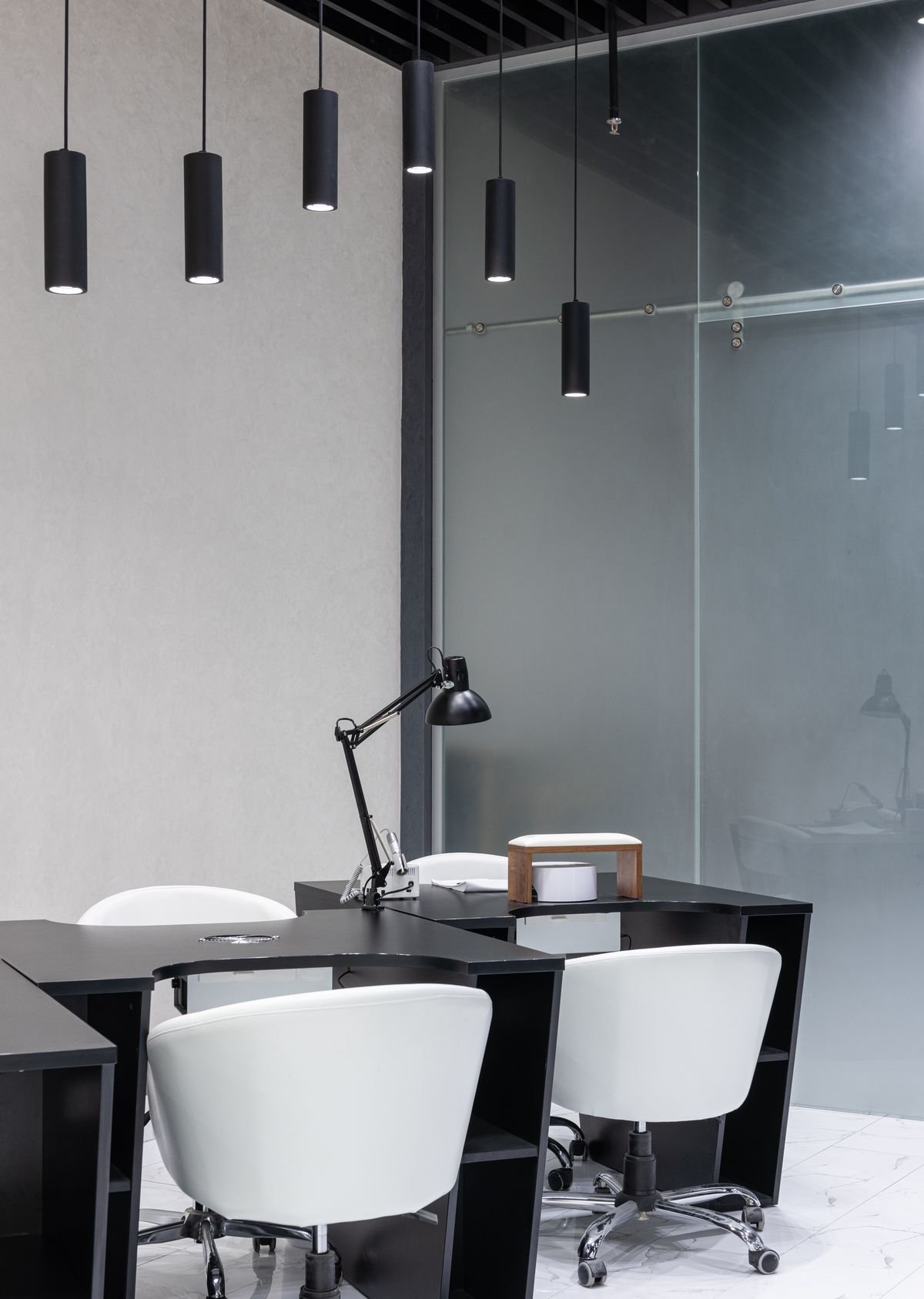
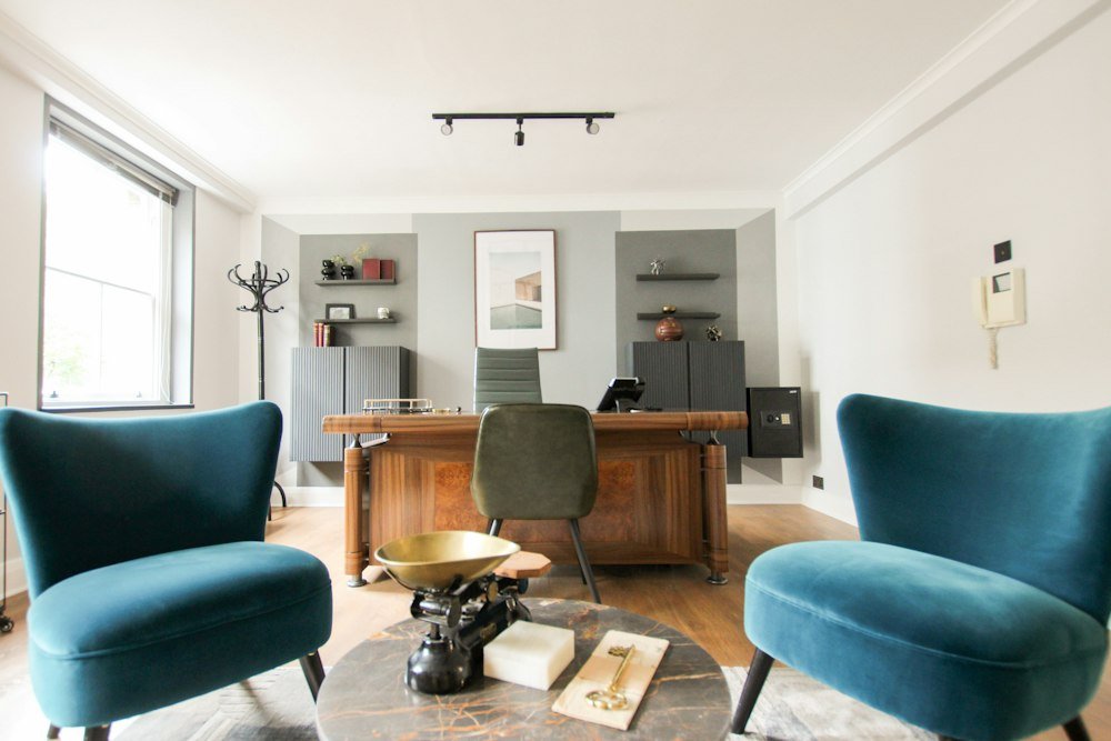
Enhancing business environments with professional, functional, and aesthetically considered spaces.